
After testing it out, Google’s officially announced the launch of new version of mobile-friendly tool on Google’s central webmaster blog post.
Recently, it was reported in some media circles that Google’s working on a new mobile-friendly tool that allows businesses to check the mobile-friendliness of their sites.
The new version of the mobile-friendly tool comes loaded with some feel good factors like a cleaner look with more space and loads faster than the previous version of the tool. Noticeably, Google had first launched the mobile-friendly tool 2 years ago, in 2014 and the latest update by Google seems to be the largest update to the tool since its inception.
Here’s what the new version of the tool looks like.
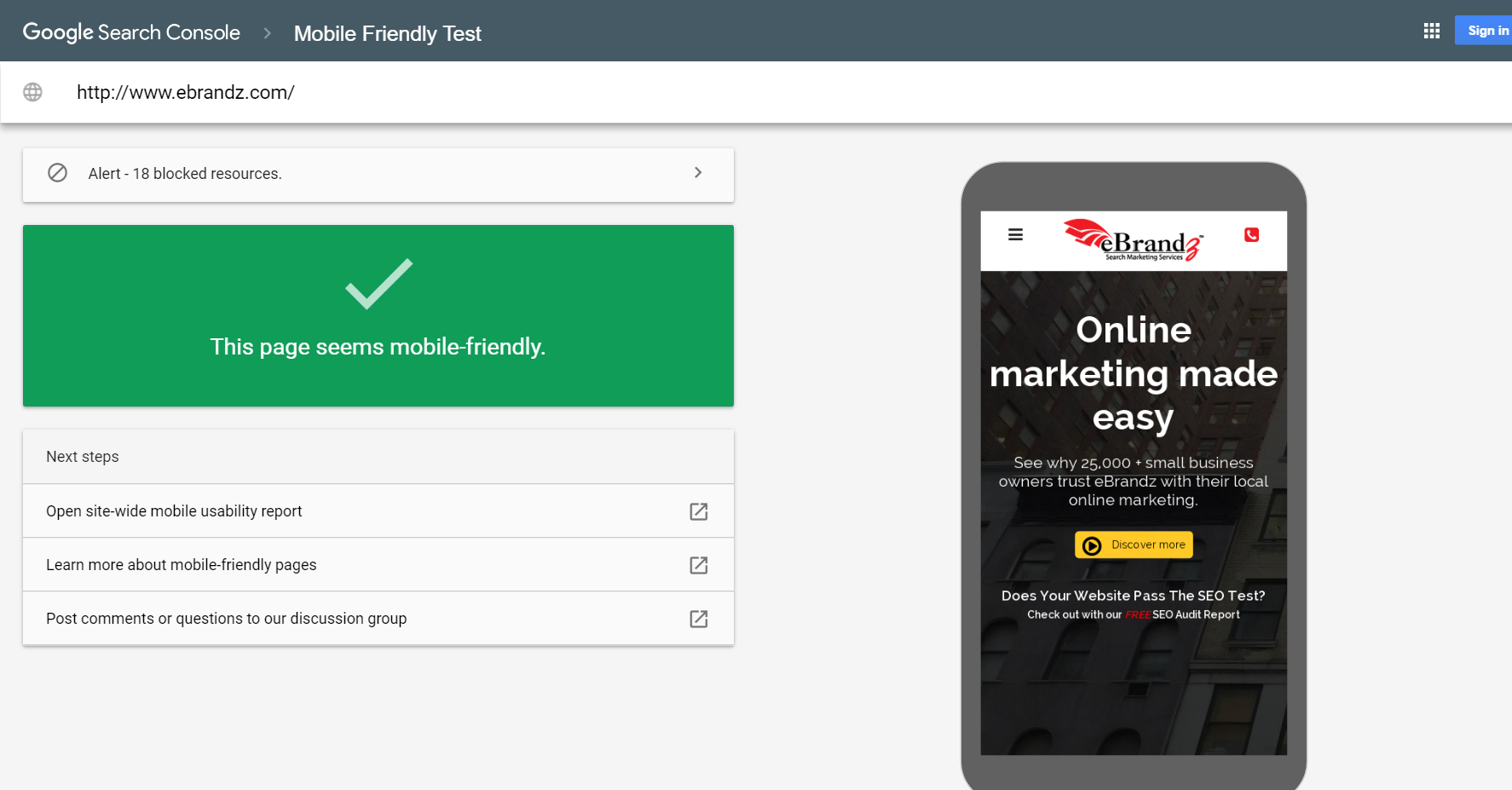
The new tool is slicker and less frightening than the original tool. Google said it brings more “room to continue to improve on its functionality, and over time, we expect it to replace the previous Mobile-Friendly Test.” The tool is mobile-friendly as well! So you can test if your sites are mobile-friendly right on your smartphone. It seems like they mainly upgraded the backend infrastructure so that they can scale it later.
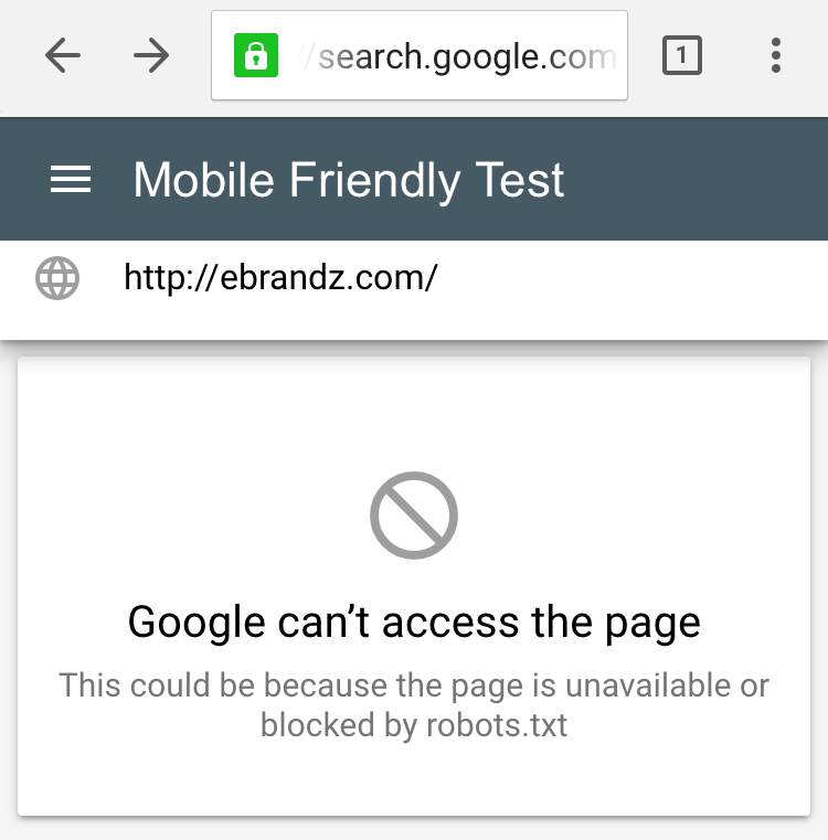
Right after the launch, there were some reports that the tool’s new version is not working on smartphones. But Google’s John Mueller, through his twitter handle asked everyone to remain patient as the update is still to be rolled out completely.
@davidjmain It’s still rolling out, it’ll be there soon 🙂
— John Mueller (@JohnMu) May 17, 2016
So if you are encountering any such problems, you’ll have to wait for the update to roll out completely.
Here’s the error report as encountered by some smartphone users.
For more detailed information on the subject, you can write to us at sales@ebrandz.com.