You’ve got great products and services that are of premium quality and come at a decent price. You have also designed a great website that is close to perfect from both UX and SEO’s perspective. You have also leveraged your online presence with social media profiles and by delivering wonderful products you have managed to receive positive reviews too.
So after getting all these things right, you just sit back and think that now your cash bell will ring continually and that your bank account will get credited with enormous dollars on a regular basis.
But, it’s not happening! Despite doing everything right, your website is not generating sales. You are seeing a lot of visitors via Analytics, but the conversion rate is too low.
Issue: – Maybe you have given attention to the big things but ignored the small details. To ensure the best outcome from your website, you have to give attention to even the minutest details since they can play a big part in sales.
We have analyzed some points where many fail to pay attention and thus are unable to generate sales as per expectations. Some issues and their tested and proven solutions are listed below.
1) Hammer your Call to Action
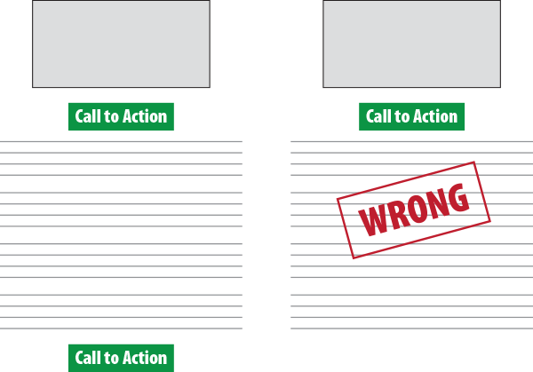
Call to action is the most important part of a site, as it will decide whether a user will leave as they come or after being converted into a customer. You have probably thought about it already and listed in your website. But just listing in one corner of the page will not work; hammer your call to action all over the website, without overdoing it. Users after reading your product description or content take a pause, as they decide what to do next. By repeating your call to action, you are actually suggesting them what they should do next. It’s like you are giving them a little push!
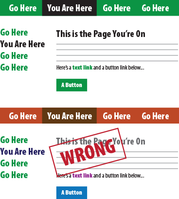
Your user must be able to navigate through your website easily. Navigation elements and links guide users as per your plan. The links you want your users to click should stand out from the clutter. Red and green are the most popular colors for action buttons; it sets them apart from rest of the links. Be sure that all your action buttons, on every page are of the same color so that the user will automatically know where to click, leaving no room for guesswork.
You have a great product and you’re confident that it is unique! So what’s the matter in showing your confidence through the website? Don’t be shy and add a button like “Interested! Wanna buy?”; instead add boldly “Buy Now”. Don’t let them think twice before taking action.

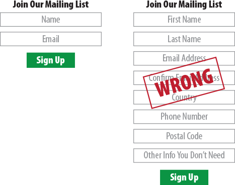
Humans are becoming lazy day by day. So if you force a user to fill a comprehensive form, he will most probably leave your website. Just note down what information you really want to collect from the users and make the form filling process as short and simple as possible. The best format will be to let them fill only two fields i.e. name and email address. But in case you require a phone number or something alike, just add one more field, but no more than that.
So, by following all the above tips you have finally lured the user to your sales page. And right now he is standing on the other side of the line of becoming a customer. So what now? How will you encourage him to go ahead? Well, you can actually cash on human behavior here. Benefits always lure people and placing the offers right next to the sales button can work wonders. Just list the “Buy now to save upto 20%” or get “50% cash-back” or any offer that you are currently providing.

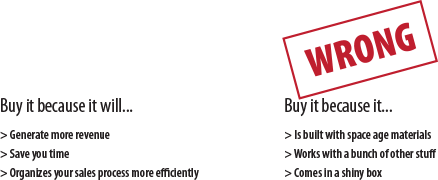
You have a good product and you’re talking about it over and over again; like the list of feature and how unique your product really is, etc. But as a customer I will not buy anything unless and until it will benefit me!
So list those features and talk about your products, but in a subtle way. The most enticing thing you can do is to talk about the benefits that users will get from your products and craft the whole copy around it.
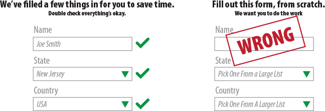
Don’t you like it when you go to a website to buy something and see that a form is already half filled for you. Ah! What a relief. Well everyone likes these sort of time and energy saving forms.
You can also set it up for your website. It may seem like magic or an advanced level of artificial intelligence, but you will be surprised to know that it’s not as difficult and complicated as it looks.
Cookies and Geolocation help a lot in filling up forms, and mostly they are accurate. You can also display the form with preloaded values which will be validated once you hit submit.
By providing such convenience, you’re pleasing your users by making their lives easier.
Your product packaging should leave eyes wide open and sparkling. The images and designs that you are using for your products must be enticing and relevant. When I was in an advertising firm, we were taught that to compel users to your ads or products everything including photos, copy and concept should be in line.
Just posting any image that appeared on iStock or Shutter Stock is not gonna help. You should concentrate on getting the best possible picture for your product. Search intensely and bring out the best image or hire an illustrator or a designer instead.

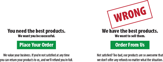
The content of your website should be targeted specifically to the audience. Replace the words “I” and “We” with “You”. Look at your website from the user’s perspective. Stop judging your website from your own point of view. This will make searchers feel that the website was thoughtfully made, keeping their needs and goals in mind.
By implementing above tips and tactics, you can boost your sales and get expected results. But don’t expect results overnight, or imagine some kind of magic to happen. Your website will perform slowly and steadily. However, the above listed issues are not all the problems your website might be facing. There can be some other issues as well. In case you want assistance write to us at sales@ebrandz.comspecifying your problem or call 1-888-545-0616 (Toll-Free).

