With every passing year, the manner in which positivity perked up amongst users and the conversion rates have metamorphosed markedly.
If we look back, customers were easily drawn in by a flashy banner advertisement. But not today, as their eyes are open wider and backed with ad blocking software.
Today, you’d have to lure them in an intriguing yet sophisticated manner.
You’d have to dive deep into their brains to find out what keeps ringing around. In order to do so, you’d need to get the hang of some industry techniques that’d allow you to create landing pages to convert people by connecting with them.
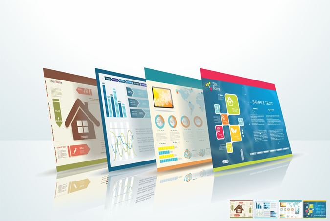
Customers are drawn in by landing pages. And these landing pages that secure success don’t stretch along a single path. They have numerous parts. If you’re unaware of these or are overlooked, you can skid on the road to success that’d lead to a stalemate. This would only minimize customers and accordingly, their leads that’d draw in more.
Let us now see what each of the eight parts have to tell us about optimizing landing pages.
1) Headline
An appropriate headline will assure customers of the targeted page being the correct one. A crisp, relevant headline will have the customer glued, making him read the entire content out of interest. They shouldn’t mirror the page title tags. Instead, it should indirectly relate to the searches & keywords that you’ve pinned in.
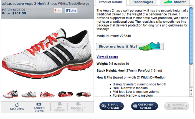
2) Design
Artistry and concepts come into play as we lay emphasis upon the conversion rate. Each customer has his own perspective while viewing pages and products. Therefore, we should come up with designs that hatch extensive views.
Let us look at the three principles.

Potential of Human Presence
People certainly do catch the eye. A bit of make-up here ‘n’ there along with fancy clothes draw in open eyes from all corners. And a product in the hand or on the foot would give rise to anxiety. This way, you’d end up gathering traffic on your website.
Lines and Markers are a necessity
‘Diagonally left, on top or at the bottom right.’ Lines on the website allow you to sway and steer the human eye as per your desire. If not for these pointers, the CTA can also turn heads to towards the targeted features.
Contrasting Consequences
In order to have features linger on in the memories, you need to make them remarkably noticeable. For that you require contrasting elements that highlight not only your product but also other aspects. Usage of contrasting colours on and around the CTA would add upon the effects, helping you catch the eye of the customer.
3) Coherent Content
Content is quite an essential element that one needs on their website. But, you cannot scribble your way to glory while you try connecting with customers. Too much of content, and you’ll have your page turned right away. Bring about simplicity in every topic, and make sure you answer every question that comes your way in an enduring fashion. This way, customers would engage and build up a healthy relationship.
Now, as we see on shopping websites, a copy stating limited period for a spectacular sale works wonders. Also, testimonials and blog with a good word of mouth bring in customers with a smile. A similar scenario would do well on your landing pages as well
4) Pertinent Forms
The human brain is wired to minimize cost. This cost might come in the form of actual money, or it might be something as simple as extra fields in your form. Minimal cost is what every human brain looks at. And while filling up a form, a few extra pockets to pen down would cough up some question marks. Hence, avoiding a decrease in conversion rates can only be done by keeping your form precise, without extra fields to fill up. As you proceed, you build up a healthier relationship that enables you to gather more information.
5) Call to action buttons
Call to action buttons tail along a message. And the message that we portray must be a positive one to have customers clicking upon the call to action button to build up a new relation, that’d allow us to hold on to them for prolonged periods.
There should only be one CTA button. A diversified set would only lead to all five fingers pointing out at each one out of confusion.
6) Analyse Adversaries
Glance upon naughty neighbours to seek ideas and methods in which you can improve your brand’s page. This way, you could outfox them in numerous ways.
While doing so, you can make use of technology. Usage of technology would give you a clearer picture of ways being used & the methods you can make use of for progress.
Each feature like headlines, CTA styles, colours, etc. can be gauged upon for a wider range of ideas that’d line up as options.
7) Include Eye-tracking
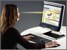
Eye-tracking tells us exactly where & what people are looking at on the screen (web page). This advanced technology gives us a perfect insight on customer vision while facing the monitor. This would lend a hand at telling you which part on the web page was being stared at by the customer, and for how long. This would help you make the necessary changes that’d ascend your web page’s stature.
8) An A/B Measurement
A measurement is what is required in order to put forth a progressive step. An A/B test is a must for successful Landing Page Optimization. These two options, once measured, would showcase results that’d leave you engaged upon the one that brings about a better result.
To see the results, bifurcate visitors into two sets, with one testing option A and the other with option B. Once done, you can then compare the characteristics of each one, and permanently show the better one the way to the big stage.
While you do the testing, you need to thoroughly adhere to these small details and rate them accordingly. The overall layout with the designs, content with its type of font, heading style and the amount of copy on the page.
Conclusion
If a customer making a purchase or filling in membership forms is what you want, landing page optimization would get you just that. It ascends online engagement that brings about customer conversion.
Numerous pages in the present era have a large scope for improvement. The conversion rates witnessed by quality pages is around the 5% mark, with an otherwise average of 2.35%.
Always keep a track of your landing page and seize every opportunity for improvement that comes your way. Subsume all or either of these 8 LPO fundamentals and see if they plug into your landing page.
If you need any help with creating compelling landing pages for your website, do check out our Landing Page Design service. Alternatively, you can email us at sales@ebrandz.com or call 1-888-545-0616 (Toll-Free) with your requirements.