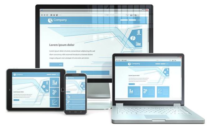
It has been reported “n” number of times in press that it’s high time for site-owners to be actually designing their website with a mobile friendly experience. While there are a lot of businesses, who have already upgraded their web presence for high-quality smartphone experience; there are a few novices, who are currently mulling the option. And if you too are looking for some cool ideas on the subject then this may help you out in your search for delivering a high quality, mobile friendly website experience.
Congratulations if you have already done that! But upgrading your site for a mobile friendly experience does not mean that you have scaled Mount Everest. But this is just the beginning of many such colossal peaks to be scaled in your search for online excellence.
It’s a fact that we are actually short of people, who work tirelessly through wee hours on their desktops. People are getting smarter and actually prefer working on their high tech, pocket-friendly devices, while on the go.
One of the reasons for PC searches outnumbering mobile searches is the fact that the stuffy URLs do not fit the virtual requirement of pocket-sized gizmos. But with time this may change.
In fact, both high ranking search engines i.e. Google and Bing have introduced mobile-friendly markers to help identify users with the site’s rendering ability on a pocket-sized computer.
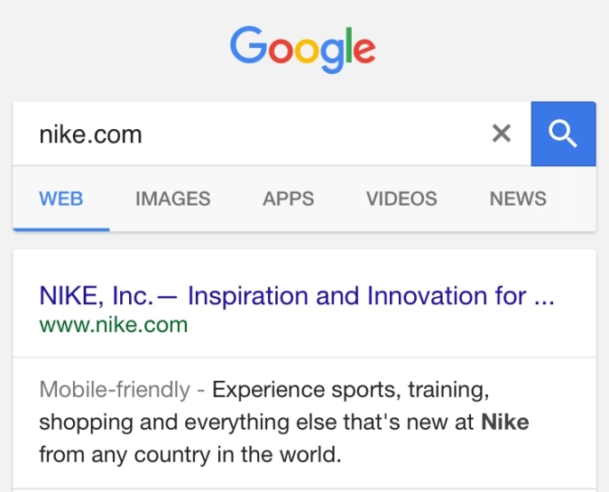
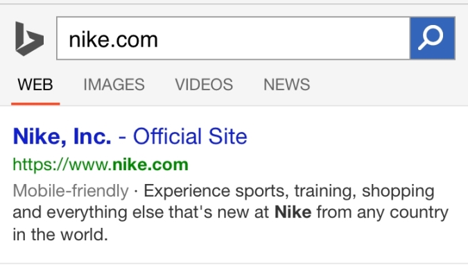
All of this started happening earlier this year in April, when Google rolled its mobile friendly search algorithm update. And post that, Google has started omitting some sites which have superior search ranking due to poor quality of mobile search experience.
Why does this matter?
If your site is currently attracting a lot of search engine traffic then there are chances that your site will be accessed by users on the go. For example while travelling, shopping online, chatting or sending e-mailers to the client from your place of convenience or working on print or commercial campaigns, you need to have a site that delivers top notch smartphone experience.
The DNA of a successful mobile web strategy
The three steps mentioned below will help you sort out your priorities
1. Who should own and manage the project?
Ideally the project should be headed by a Chairperson or some senior company official with futuristic vision. The project leader should work independently and have the authority to make decisions on his own.
2. What are the objectives? Are they realistic? Are they measurable?
People having stakes in the company’s bearings must agree on one single objective of the company and then figure out how mobile gadgets can work on those lines. Never compromise or move away from those planned set of goals. You can even place them in your official premises.
3. Who is the audience? Who, what, when, where, why and how?
You need to do some SWOT (Strength, Weakness, Opportunities and Threats to your brand) analysis on the basis of your company’s set of objectives or goals. Then figure out your target audience on the basis of their habits, age, financial status, the kind of gadgets they use, their search and site behavior, preferences, etc.
Answering the above questions will provide you with marketing insights and a vision to move forward in the right direction. This will also help you in locating your potential customers or target audience.
And if you need any help with mobile friendly website design, we can assist. Just email us at sales@ebrandz.com or call 1-888-545-0616 (Toll-Free) for assistance.